
Overview
As a person who is planning a trip, I want to ask for recommendations in my destination so that I can plan my trip and choose an accommodation based on a location.
Make the most of your time and money, plan your trip and stay at the ideal place for your next trip based on recommendations from Booking.com and your friends.
Problem Statement
During June 2017, Booking.com organized a hackathon in the city of Guadalajara. The challenge was to solve the question:
What would you do to empower people to experience the world?
For 48 hours we would work as a team to understand the problem, validate the idea, create a functional demo and present it to the jury. During the event, we had the help of Booking experts to understand their business, their users and their behavior.
Due to the short time we had, we decided that through a small Design Sprint we could achieve a better solution.
We started by sharing our experiences, points of friction and assumptions about the improvements that could exist to help when booking a place. We came to the conclusion that with the help of recommendations a user could plan their trip and find the ideal location to stay based on their plans.
Users and audience
For the hackathon we focused on the "captains" of the "crew", who usually lead the organization of the trip. People who who like planning. They usually read travel guides (Lonely Planet, Rick Steve's), watch video blogs and download maps to their mobile before starting a trip.
Once they have a basis for the trip, they share to listen to suggestions and meet the needs of all the companions. They plan the trip in spreadsheets in order to have an overview of everything they can do and assign activities for each day of the trip.
Team
Initially, two partners (Eduardo and Antonio) and I thought about creating a team to participate in the event. Once there, a designer from the UX Nights Guadalajara community (Carlos) joined the team.
Carlos and I had experience carrying out Design Sprints, so we organized that part of the activities. I created a document of requirements that was being filled out with the information we decided on.. We were all very involved during the small Design Sprint, where we later divided the tasks to create the functional demo.
Constraints
Because we only had 48 hours, much of the information was based on suppositions and information obtained from interviewing Booking experts.
By having two developers in the team, we did not know if we would finish the development of the prototype, so we created two prototypes (one with code and another using InVision) which confused the judges.
Design Process
We started the Design Sprint by understanding the problem: What is the current situation? How is the problem solved? What are the problems that arise?
Once we all shared our experiences, we created a list to summarize the current situation:
- Many tabs in the browser (different pages to book hotels, maps, place reviews)
- Individual work ("Captain" of the "crew")
- Where to start? Locals vs Reviews
- Cost and time (transport)
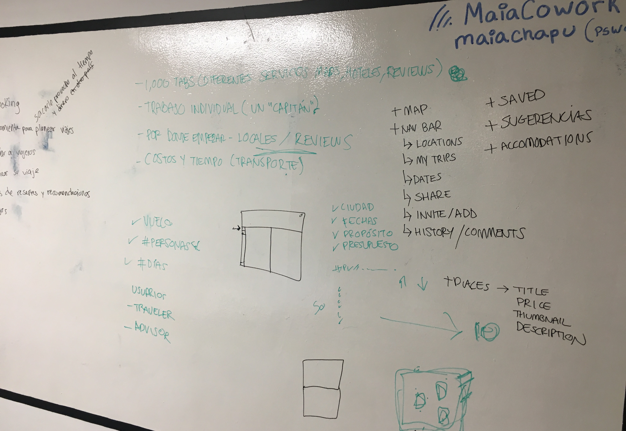
Taking into account this information and the question raised by Booking.com (what would you do to empower people to experience the world?), we decided to develop a feature to help travelers plan their trips with reviews and recommendations from Booking.com and their friends.
Our hypothesis was that this feature was going to generate more engagement with the travelers and make them stay longer in the website, at the same time, it will create a new channel when the user invites their friends to give them recommendations.
We fill out a template of requirements: define the user's goal, the assumptions and who would be the stakeholders. We created a list of the tasks that the user would perform to achieve a goal, which helped us to define the features and later the scenarios. Once we defined the flows for the demo, we move to the User Interface.
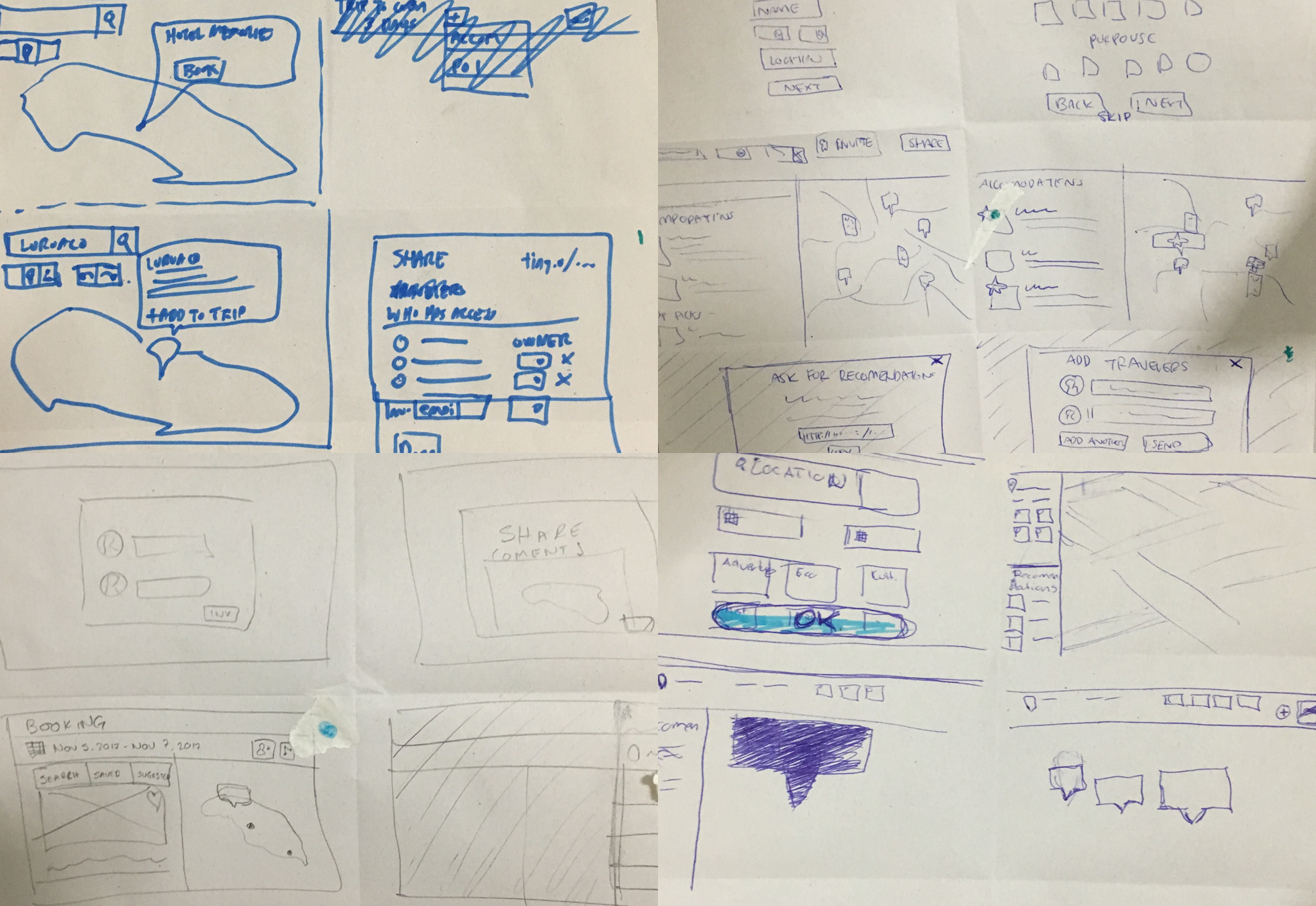
We made a Crazy's 8 to see the ideas that everyone had about the User Interface. We voted and divided the work: while Carlos and I worked in the mockups, Antonio would work in the back-end of the application and Eduardo in the front-end.
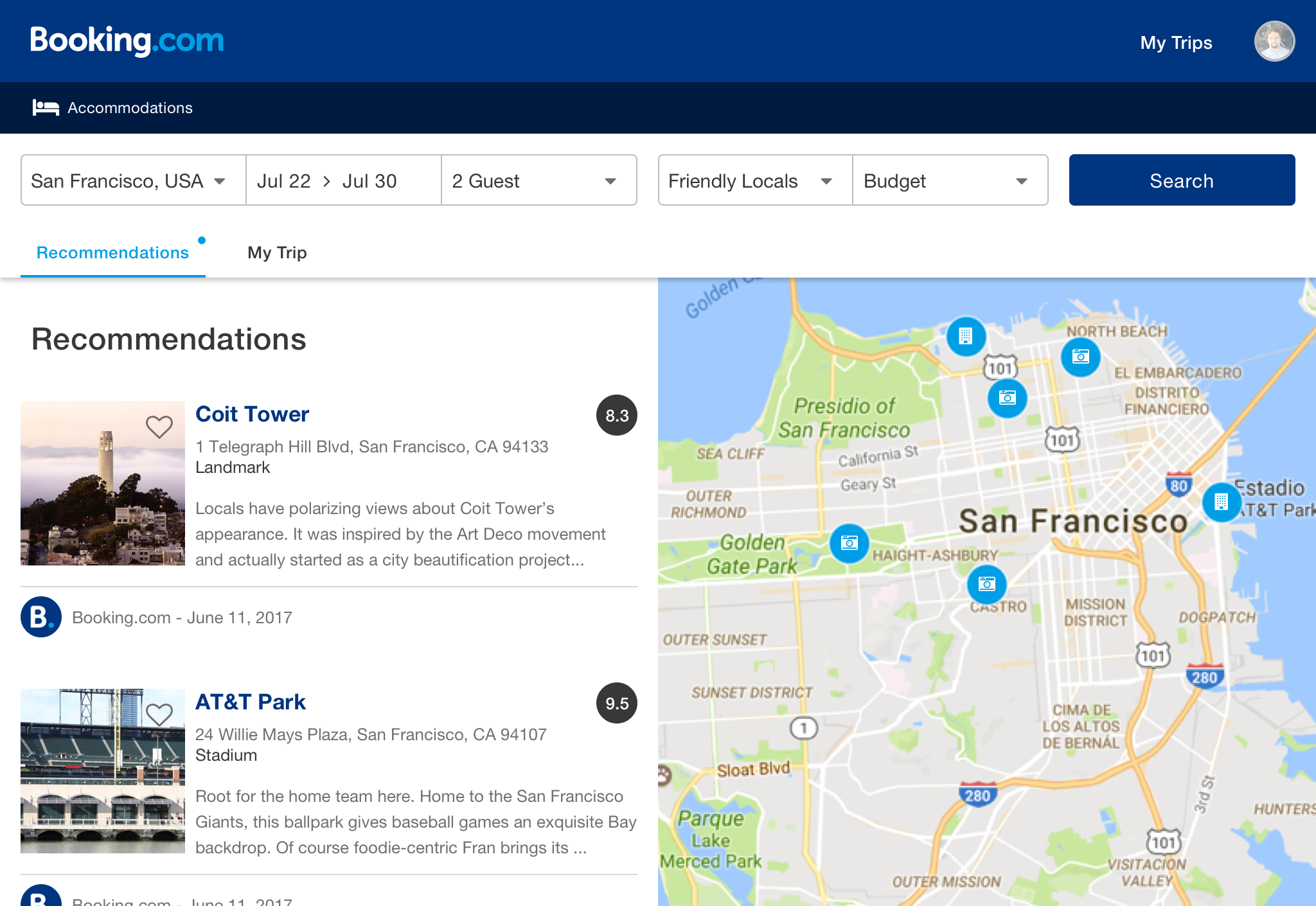
How would we include this new feature in the current flow of Booking.com? We decided to add two questions when making a search to have a context of the trip and to suggest initial recommendations (by the Booking.com team),so we add a field for "Things To Do" and budget.

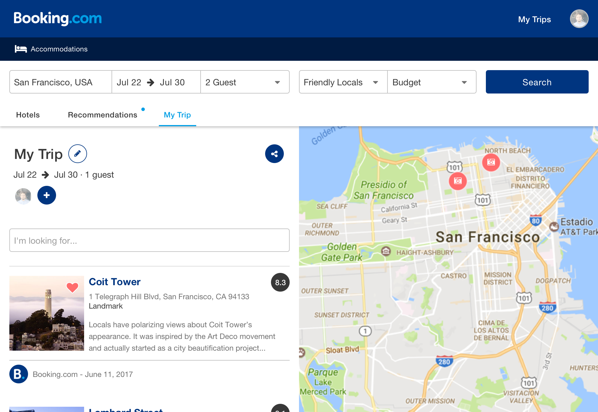
The results page was divided into three tabs: hotels (which is the current view of Booking.com), recommendations and My Trip, which would be a list of recommendations that the user has saved.
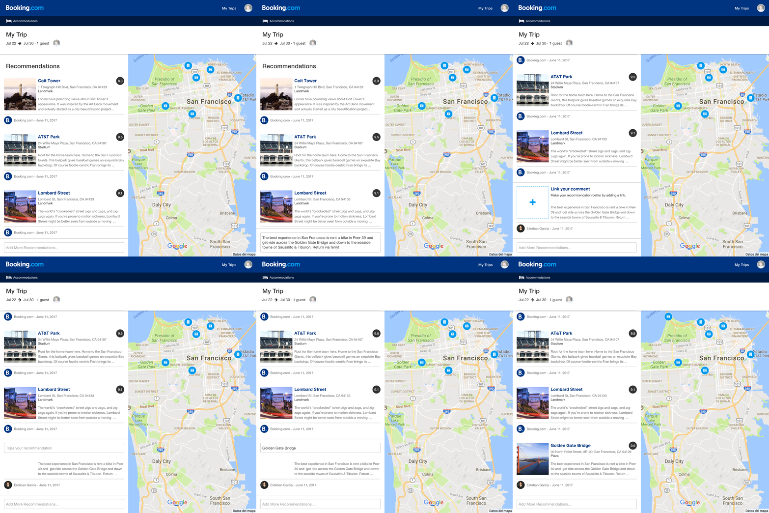
In My Trip section, the "captain" can add his "crew" to the trip, share it and add places.
Other stakeholder comes into action when they visit someone else's trip. They could see general information (dates, people who will make the trip), as well as a list of previously saved places.
They could write recommendations and link places so that travelers can review them and decide if they want to include them in their trip.
To measure the success of the feature, we would analyze three variables:
- Traffic on all three tabs
- Number of users
- Number of reservations
The ideal scenario would be an increase in the time the user spends in the new tabs, the number of times shared by the trips and the number of reservations made from places saved in those lists.
The Result
After two days of work and a few hours of sleep we finished the functional prototype, a backup prototype (in InVision) and the presentation.
Retrospective
Different approaches
It was very interesting to see the different approaches to solve the same problem. From bots that helped you book to a virtual key to facilitate the check-in process. It was very enriching to see the final results.
Link places
Once we made the demo I realized that the way in which places were linked to the recommendations was not very natural, the text "Link your comment" does not explain much and can be interpreted in many ways.
Booking.com business
The integration with Booking.com could be better. The business of Booking.com consists in booking places, so we should have made better use of it and put more emphasis on obtaining reservations.