Credytag
Project
Business & Customer Website
Role
Product Designer
Date
— Present
Overview
As a business that offers home delivery, I want to be able to charge quickly and easily, so that I could offer the service without having to worry about security or the training of my staff.
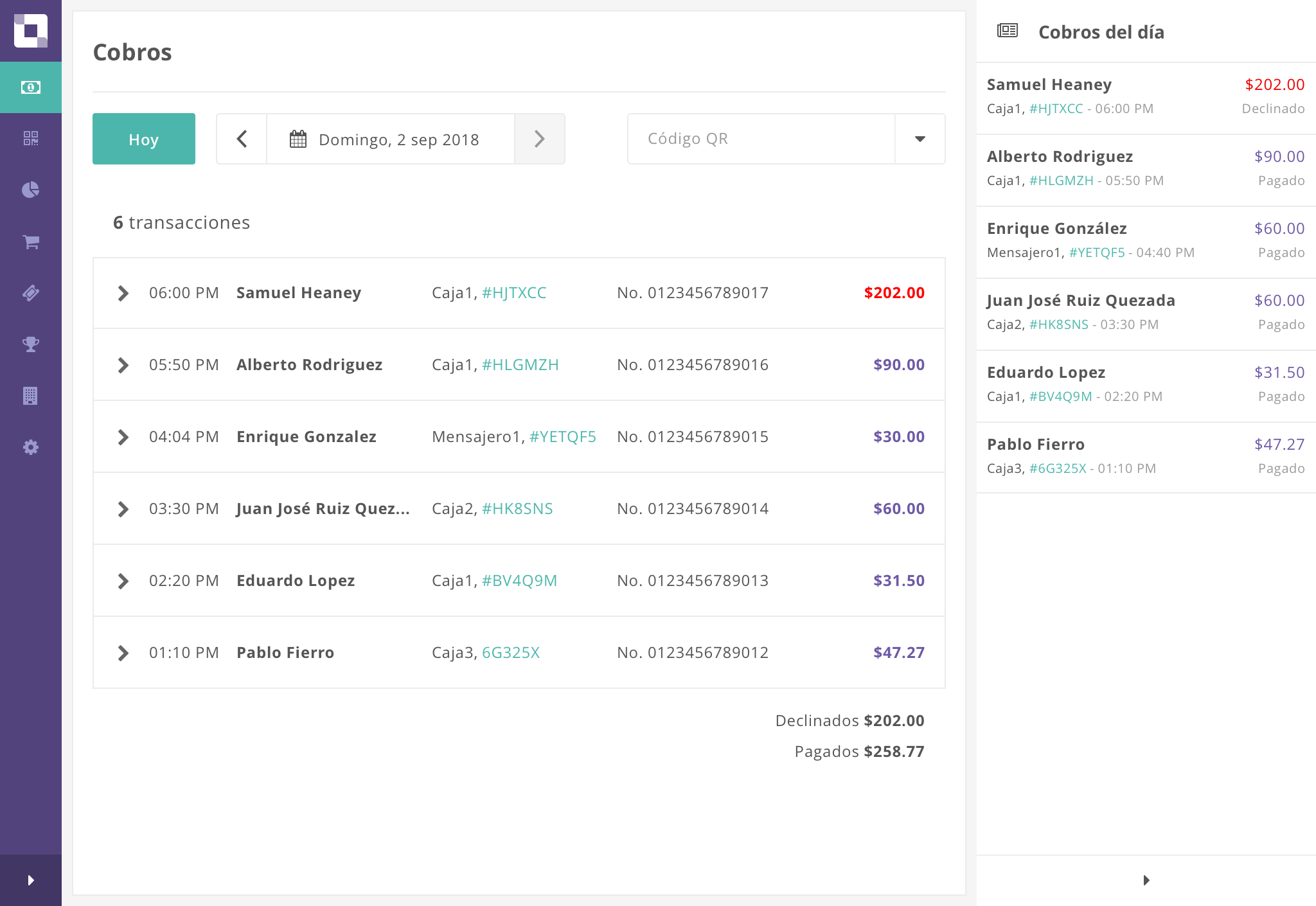
Improving the experience of collecting your delivery orders. Credytag is a safe, fast and simple solution to collect money so you can focus on your service and your customers.
Problem Statement
Credytag started in 2015 as part of the Startup Weekend World Hackathon that took place in Guadalajara. The initial idea was to create a way to pay at stores that don’t accept credit cards.
After validations and pivoting the idea, Credytag realized that the problem had to be solved for both sides: the need for businesses (especially micro and small ones) to be able to accept payments without having to depend on payment terminals, smartphones and electricity; the need for buyers to be able to pay safely and have a record of their expenses without the need to give their bank details, bank card or even bring cash.
Users and audience
Credytag is targeting businesses and buyers.
Businesses
Micro, small and medium-sized businesses that have delivery service. As growing companies, they have a small staff and have to take advantage of their resources. In Latin America, many people still don’t have a smartphone or a data plan on their cell phone, so the collection of the delivery service using a chip or reader is often complicated.
Buyers
Tech-Savvy people from 18 to 35 years old, middle-high socioeconomic status, who have a debit or credit card, make purchases online and subscriptions to digital services.
They want to solve their daily life problems in a simple and safe way. They feel comfortable paying from their mobile phone.
Team
Credytag has a team of fifteen people (developers, designers, project managers, sales, business, marketing, etc).
Development is divided into two teams: Business Application and Buyer Application. Each team has developers (front-end, back-end, mobile), a project manager and a designer. I work in the Business Application team.
We use the Agile methodology: two week sprints, a weekly meeting to discuss task, show progress and have an overview of each task. In this way we can measure the progress of the project.
Constraints
Credytag started with one designer and due to the workload there was no time to create guidelines, so when I joined the team I had difficulties following the brand already created.
By not working full time, creating a workflow and a solution to unify the design between the two teams was complicated. We worked with two platforms (OSX and Windows) and with different tools (Sketch, Zeplin, Illustrator, Photoshop).
There was no methodology (no Project Manager, no sprints, no weekly meetings), so it was difficult to know what was the status of the other teams as well as to measure the progress of the project.
Wireframes were created without thinking about technological constraints, so when I started to work on the mockups, wireframes had to be modified taking into account the technical limitations.
Design Process
Initially, the founders conducted interviews with users and decided what were the problems to solve for each user. Credytag started with one designer (Juan Pablo), who created the brand and much of the Buyer Application, so Rafael (co-founder) created the workflows and wireframes for the Business Application.
I joined the team in August 2016 as a Product Designer. I created the first version of the application based on the mockups of the Buyer Application and the wireframes of the Business Application.
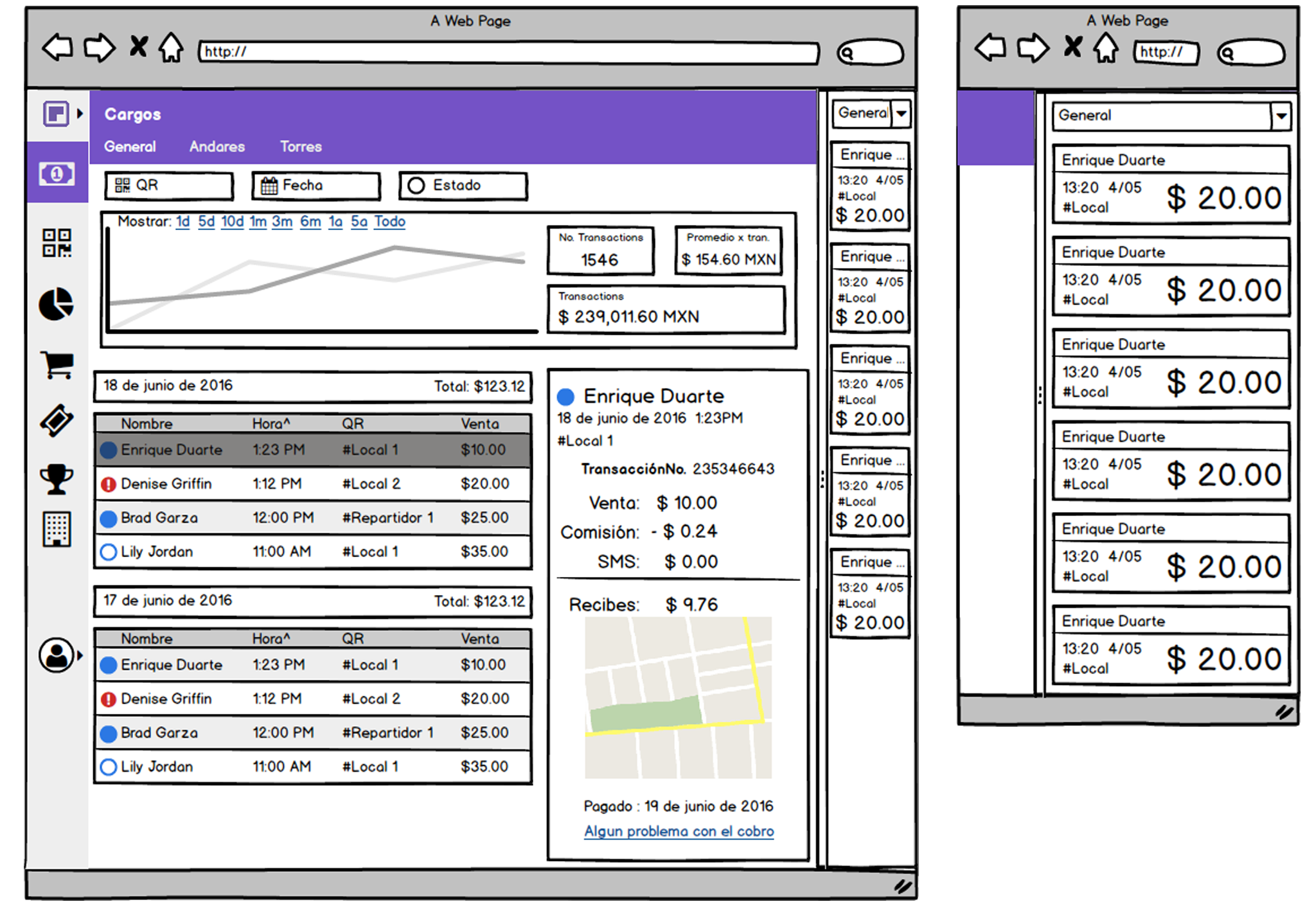
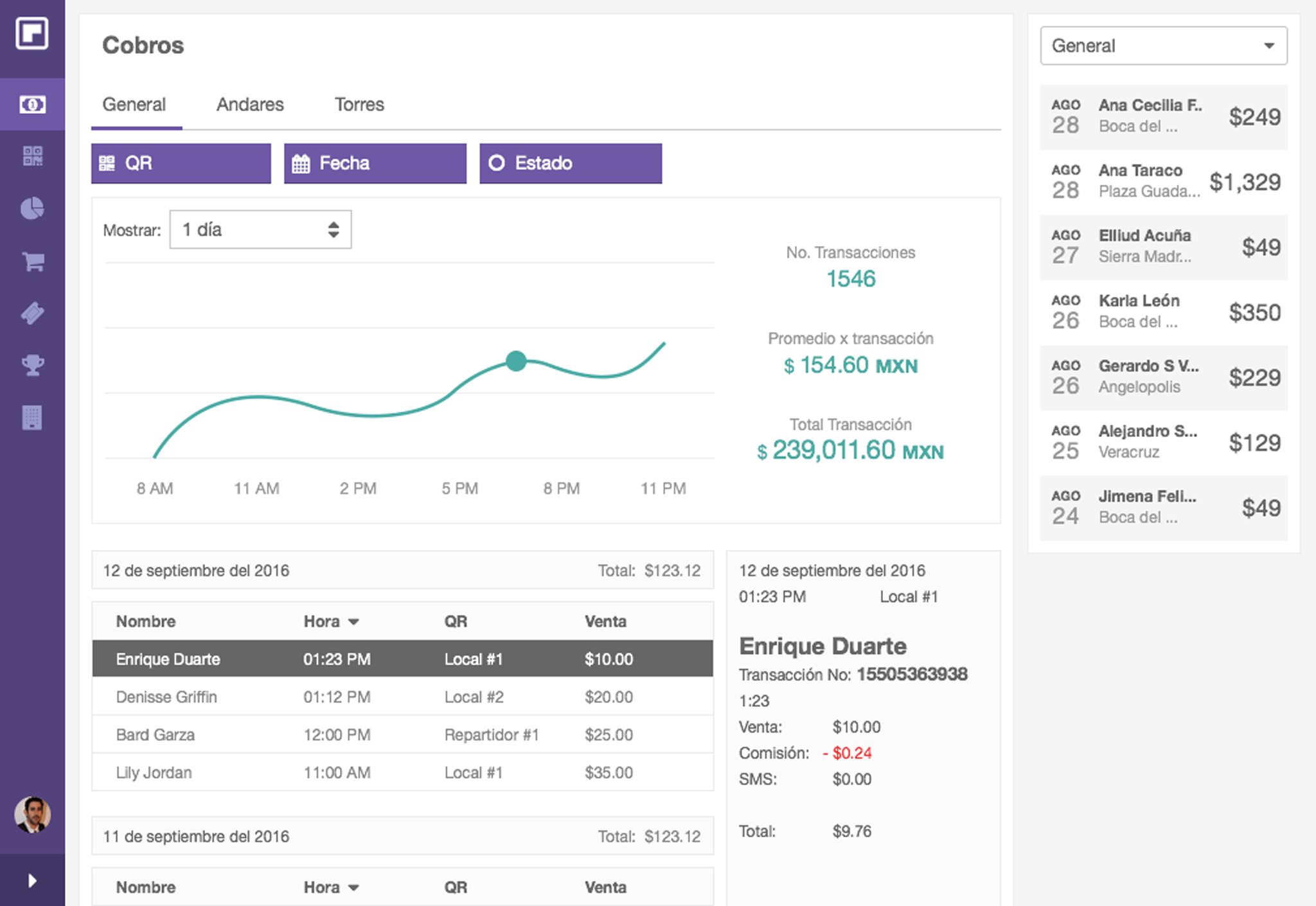
I noticed that something was not right with my proposal, so I talked with Rafael and we noticed that wireframes had been created some time ago and had not been updated to the needs of the user. We worked on a new proposal taking into account the user, the tools he uses in his day to day, the Content-First approach and the fact that it is a responsive design.
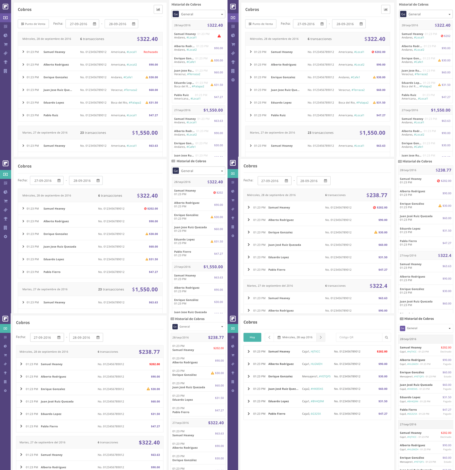
Once the layout was created, I worked on the creation of style guides, as well as a workflow between designers and developers, to facilitate communication and make the work easier. We create a board using InVision to share the components created in the layout, as well as colors, typefaces and styles.
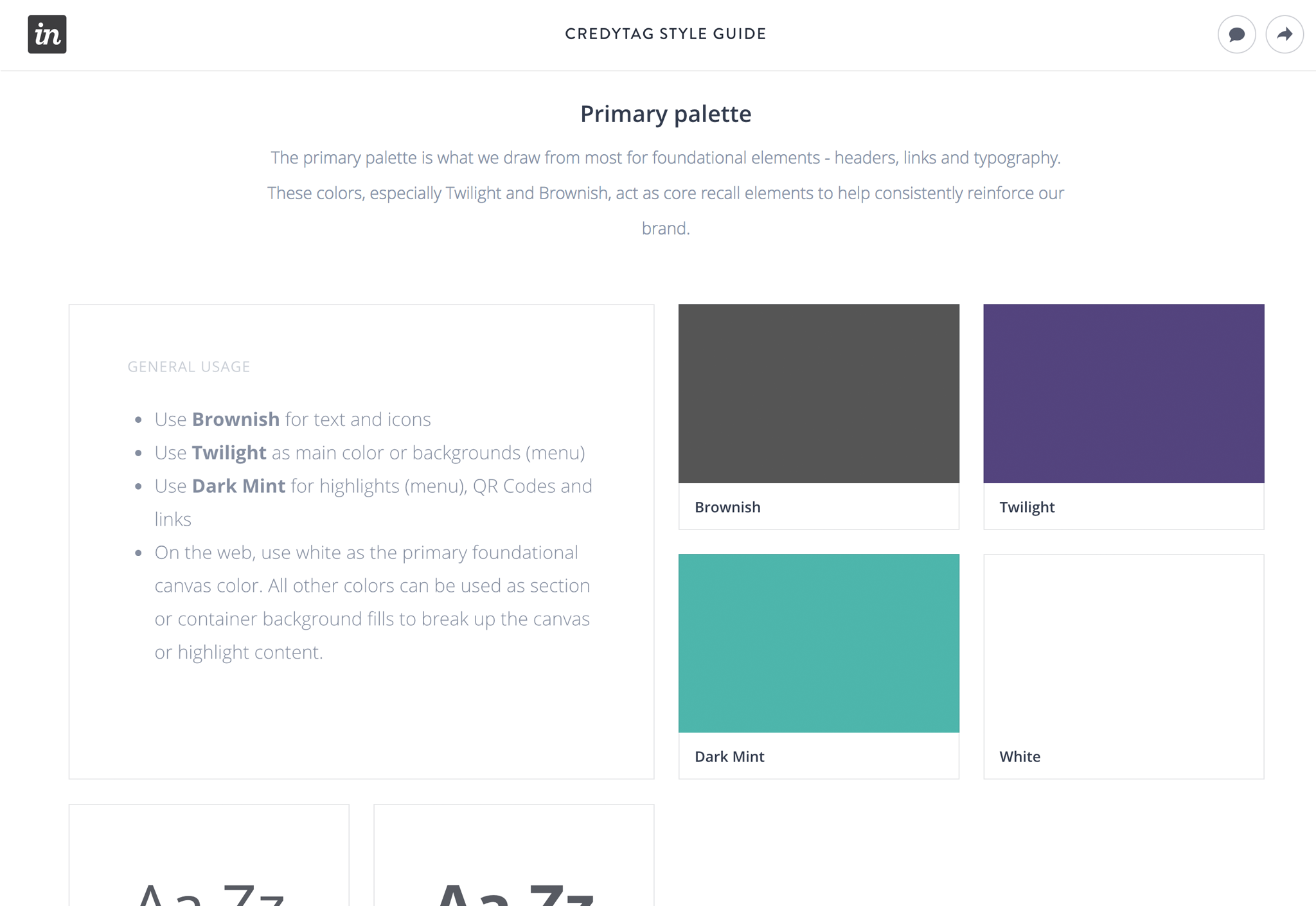
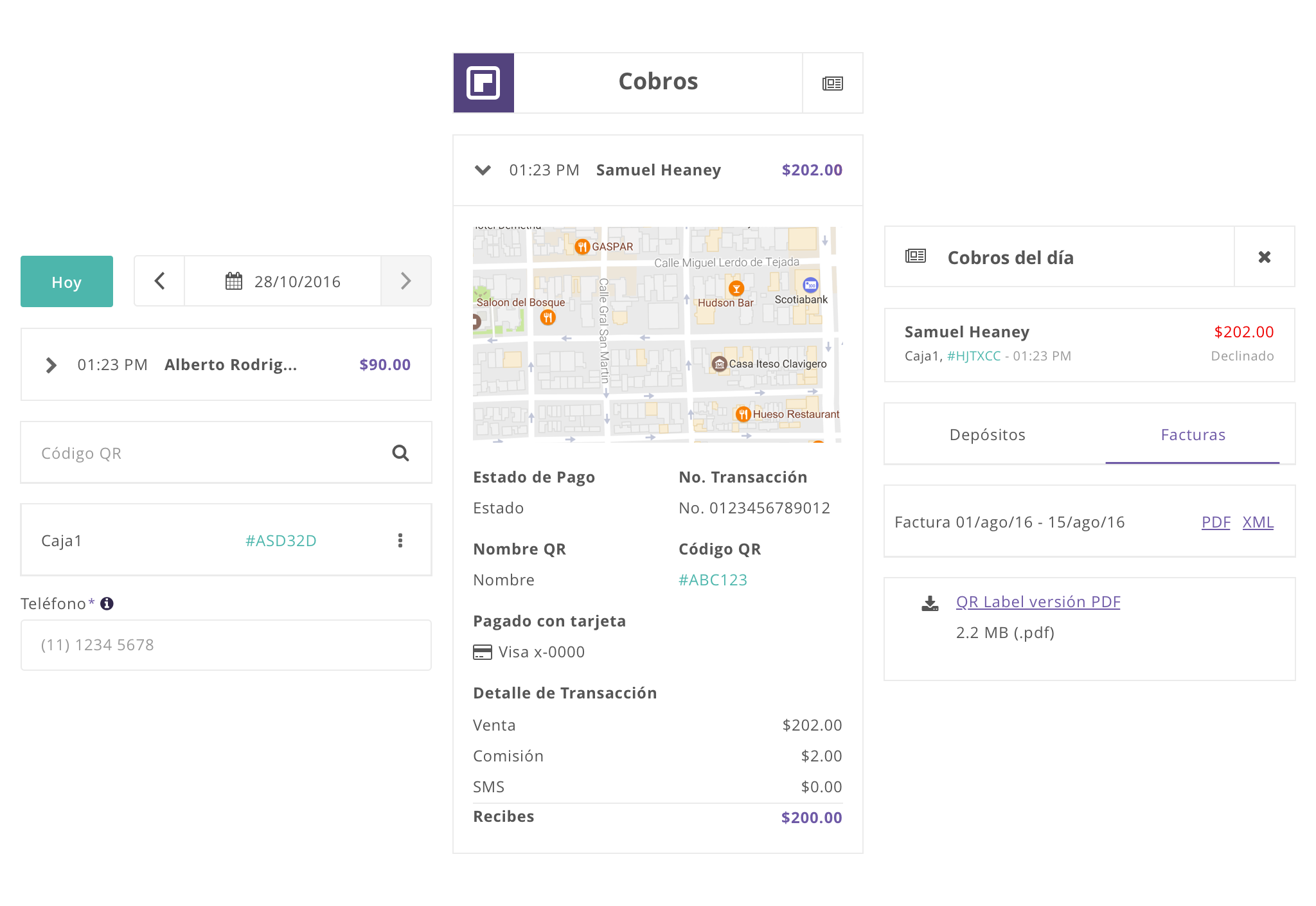
The process to create the visual design was the following: Each mockup was created using Sketch. Once finished, it entered a phase of Q&A with the rest of the team to check that the functionality was adequate and the flows were followed correctly. When the design was approved, it was shared with the developers through Zeplin where they could review the style guides and downloaded the assets to work on the implementation.
It was a responsive design, following a Content-first approach, where we determined what the user wanted to accomplish depending on the device they were using. We always kept in mind what the task was and how the user will achieve the goal.
Once I finished the responsive layout and the first view, I started working on the other views of the application.
Credytag is currently under development, with most of the visual design of both applications finished and waiting to be presented to stakeholders.
Retrospective
Understanding the user
When workflows and wireframes were created, the prior knowledge of the user and the current tools he uses were not taken into account, so the first versions turned out to be complex and felt like a mixture of applications rather than a product focused on the user.
Lack of organization
Starting a project without a work methodology and a defined workflow made us work several times on the same thing and not understand the status of the project. With the integration of the Project Manager and the implementation of the agile methodology, the project evolved significantly.
Work in a startup
Being a startup that is looking for investors, you have the pressure to create an MVP fast but without leaving aside important functionality to achieve the user's objectives.