TripTailor
Project
TripTailor
Role
Co-Founder & Product Designer
Date
—
Overview
As a person who is planning a trip, I want to know what are the options in my destination so that I can choose based on my liking and get more out of the trip.
Planning a trip is time consuming if you want to make the best out of it (stay in the best places, eat at the best restaurants, go out to the best venues) since the person has no knowledge of the place.
Based on your liking, TripTailor makes you precise and tailor-made recommendations for your next trip in terms of housing, activities, restaurants and nightlife, so you can get more out of it.
When planning a trip, I want to know which hostel meets the features that interest me, so that I can book and not worry about reading reviews.
Helping travelers to find the best hostel that meets their likes so they could book it without reading tons of reviews.
Problem Statement
Back in 2013, Luis (founder of TripTailor) noticed that he constantly ended up in bad hostels due to inaccurate reviews. As time passed, he realized that travel apps have narrowed the options and made it easier to book, but have stopped innovating, so he decided to work on a way to improve the experience.
To achieve this, we started working on an innovative proposal to find the best hostels, taking into account the user's liking and looking to solve the problem of inaccurate reviews. We decided to start with a responsive web app to test the proposal with real users and to understand their experience a bit better when searching for a hostel.Users and audience
Our target were tech-savvy people from 18 - 30 who make a great trip at least once a year. They are motivated by the desire to know other cultures and create a life experience. They prefer a curated experience over price. Due to their desire to meet people while traveling, they stay in hostels because they are a community hubs.
Every year they run into an exorbitant amount of information before their trip. In their day to day they use trendy applications (Uber, Tinder, Airbnb) and are frustrated to not find a tool with a good experience in the subject of travel planning. With TripTailor, they will find the matches based on their preferences, saving time and effort.
Team
TripTailor started as a team of three people (two developers and one designer). Luis Galeana was working on the model (Machine Learning), Samuel Heaney focused on infrastructure and scalability while I took care of the experience and visual design. Later Orianne Gambino joined the team to take charge of the strategy and communication aspects.
Luis and I brainstormed how to improve the word search experience while Samuel was working on the back-end. Once we came up with an idea, I made wireframes to review them with the team and receive feedback.
After some internal iterations, I created the mockups and a functional prototype (using InVision) to do some user testing with real users. Luis and I went to hostels to interview people, ask them about their current experience, know the points of friction and show them the prototype using a mobile phone to get feedback on our proposal.
Taking into account our users, I used references of trendy applications (Spotify, Tinder, Airbnb) to create a brand that felt modern but at the same time gave confidence to the user.
Constraints
By not working full time on the project on several occasions the project could not advance at a good pace. Development often exceeded the design and Luis had to help me with user testing or interviews with the users.
Another problem was the Mexican culture and its way of seeing the hostels. In Mexico, a large part of the people who travel see the hostels as something of low cost, dirty and messy, so that limited the feedback. We had problems talking face to face with potential users because in Guadalajara (second largest city in Mexico) there are not many hostels.
Finally, the main constraint was to convince the user that what the application was proposing was accurate since they did not understand who was recommending it and how it was doing it. We tried to explain it in many ways but users found it very difficult to leave such a strong decision to something they did not understand in its entirety.
Design Process
In 2013, Luis had the feeling that he was not the only one who ended up making the wrong choices due to inaccurate reviews. He started working on a way to solve this problem and in 2015 Samuel Heaney and I joined TripTailor.
Luis had talked about this problem with some people and we assumed it was a common mistake. We began to work on a proposal where the user could write the city he was planning to travel to and a field to write down the characteristics he wanted the hostel to have. In the results view he could see the main features of the hostel (highlighting the ones he had selected).
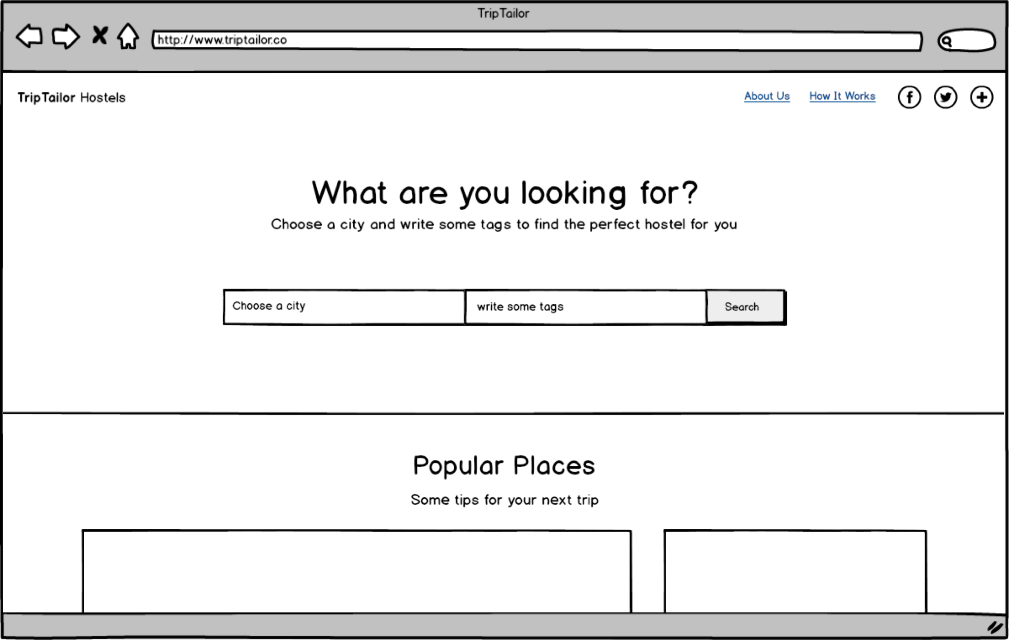
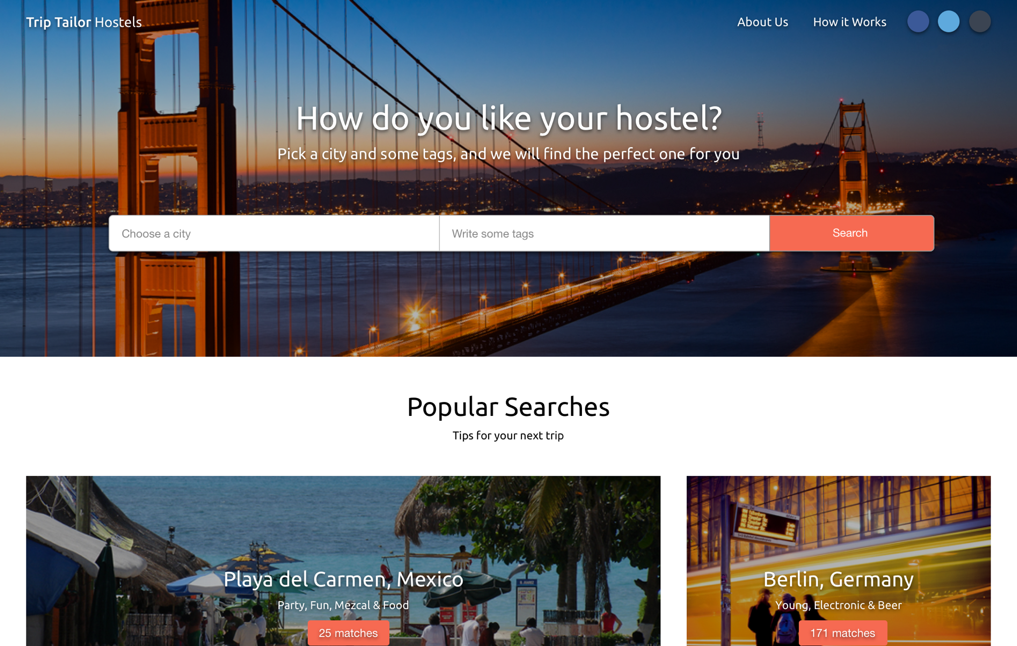
We created a prototype using InVision and tested it in hostels in Guadalajara. We realized that the user did not understand what the label field was for and rarely used it from the beginning. We had created a page with good visual design but we were not explaining how to use it.
After doing some tests we understood that the tags were useful to filter the information, but we were not teaching the user how to use them properly, so we decided to iterate on the homepage (adding an explanation about the tags) and on the detail page (possibility to filter the reviews with tags).
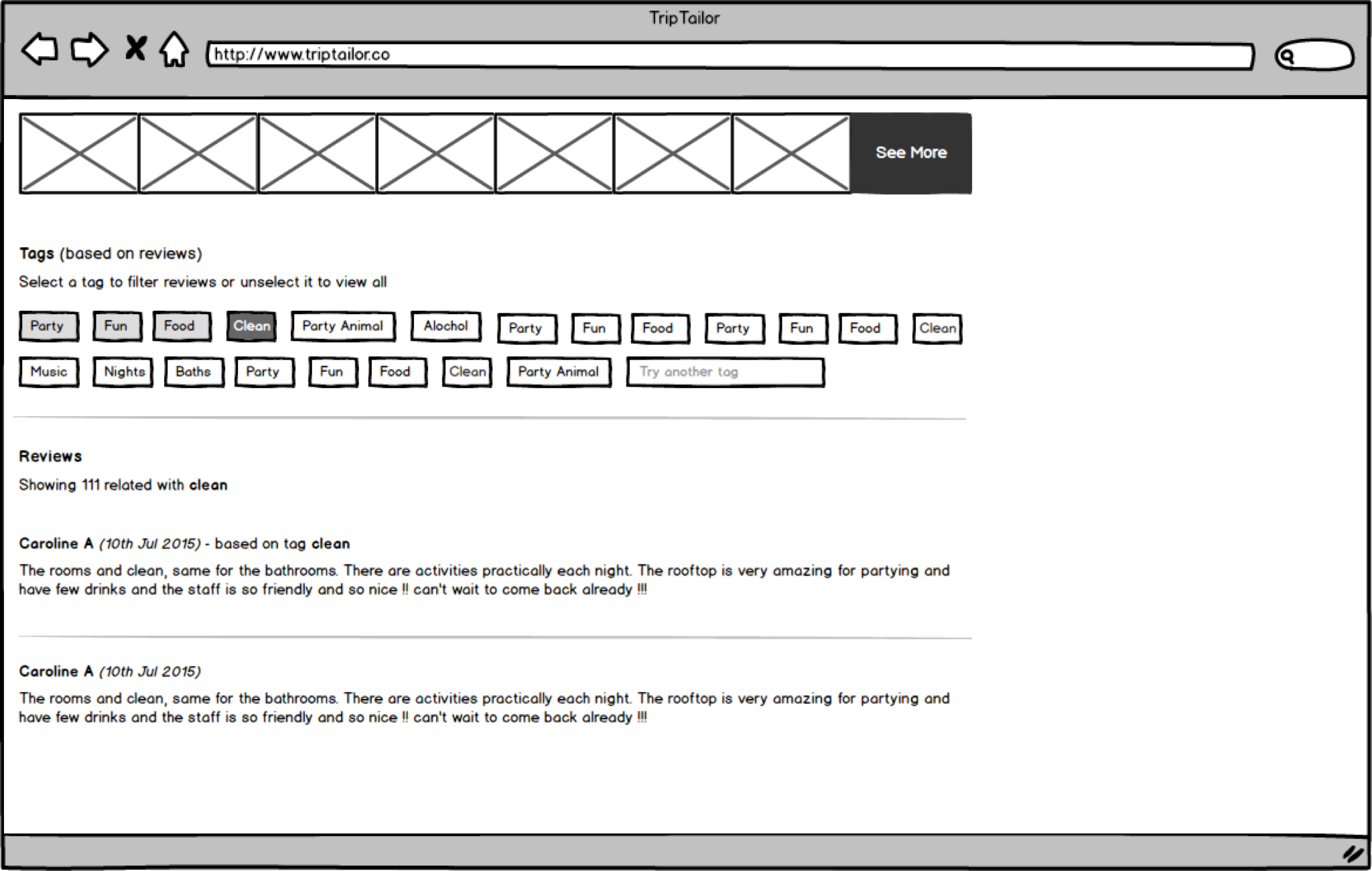
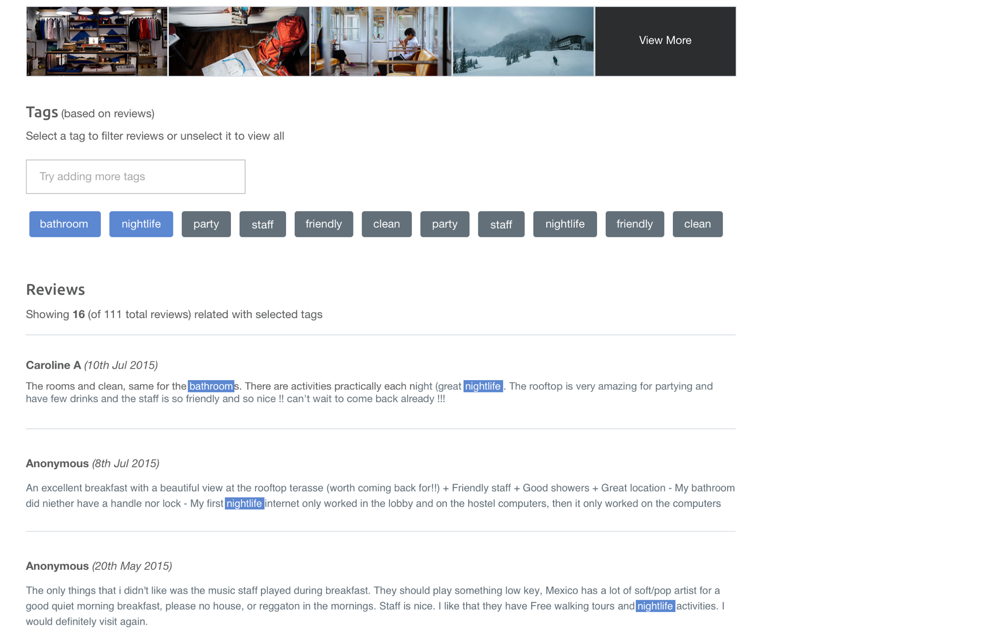
We did some tests and we were surprised to see that the user still didn’t use it from the beginning. We had to reconsider the design and focus on the proposal with the keywords. We got together to brainstorm on how to improve the user interface and guide the user so that keywords were the engine of their search.
So we simplified the interface and focused only on the search, we split the flow into steps and created a very simple guide so that the user could understand how to use the keywords.
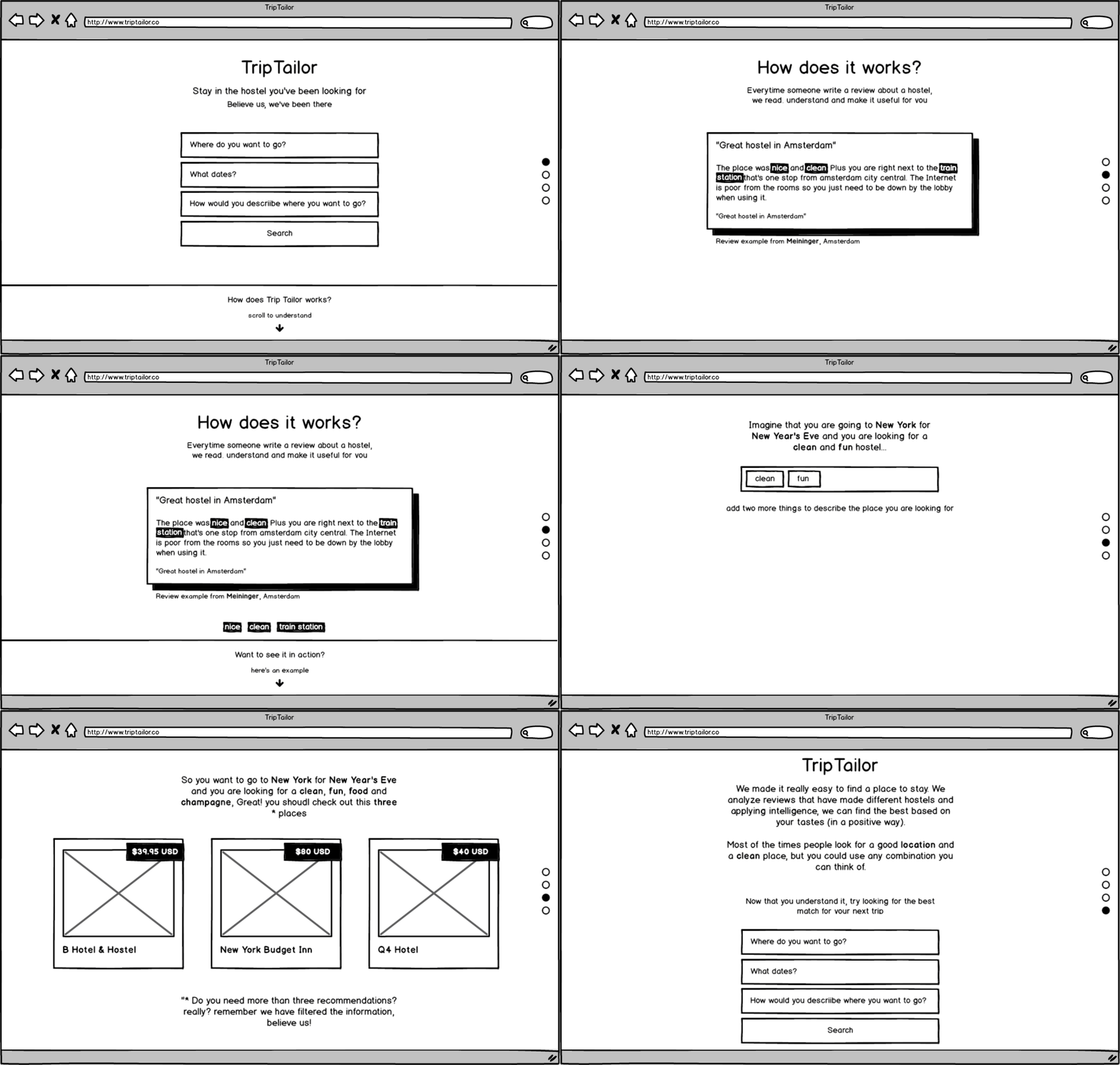
We made constant iterations in the texts and in the way in which the keywords were chosen. We wanted the language to be more natural for the user, with a defined personality and easy to understand by our users.
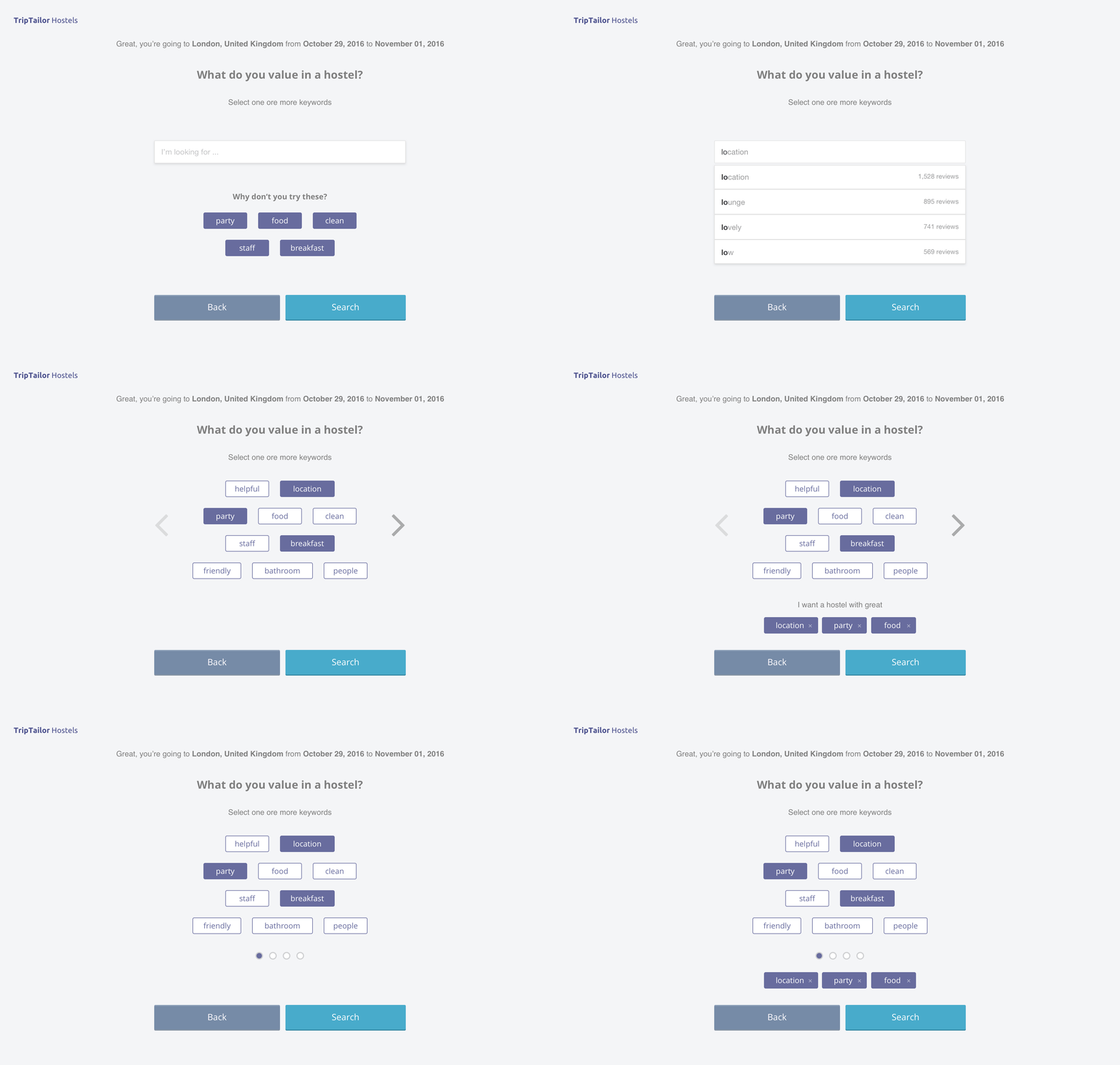
Once we were satisfied with the proposal, we merged everything and launched a new version of TripTailor. The user was guided through his search and used the keywords to refine the results.
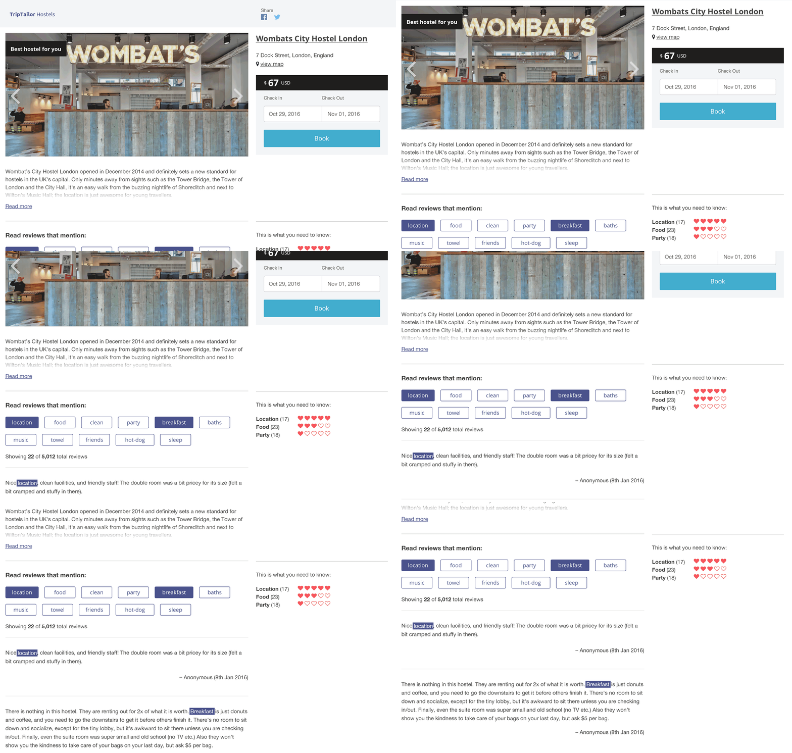
We iterated a lot on how we should show the user how many people had a positive opinion on each category. We thought about showing the number of selected reviews, showing a scale (rating, stars, etc.) and decided to show hearts: more number of hearts, more people expressed a positive opinion about that feature in the hostel.
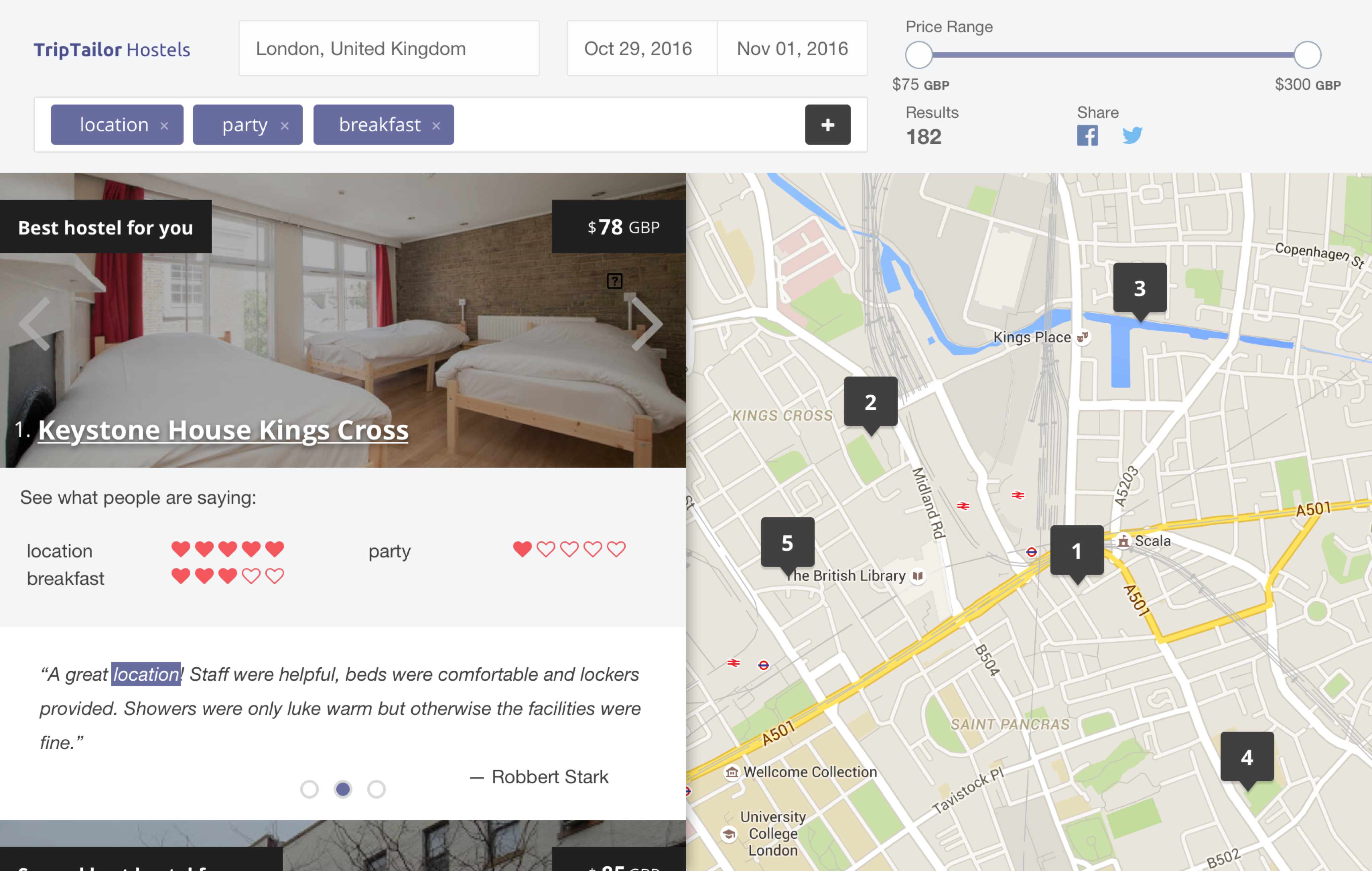
The number of results was also an important issue. We thought it was difficult to choose between many options and if TripTailor was already doing the filtering automatically, five results would be enough (although we showed how many hostels at least once contained all the selected characteristics).
Users could now see a review of each of the selected features from the results page. On the detail page, they could filter the reviews with the main characteristics that the hostel contained (whether or not they were selected at the beginning).
The product was finished and ready to be released, looking to continue analyzing the behavior of users and iterate based on the results.
Retrospective
Problem Statement
At first I did not understand the problem and I focused on creating something very similar to what already existed with the complement of the keywords (more a feature than a solution itself). I found it difficult to understand that we should improve the experience and not just include it in what was already out there.
Start by talking (a lot) with the user
Many of the iterations could have been avoided if I had done more interviews with the user to validate the hypothesis and better understand from the beginning how the problem was presented to the user and what they did about it.
More use of paper prototyping
Paper prototypes work perfectly to validate ideas. We could have got faster feedback if instead of worrying about the visual design we had tried functionality, flows and texts with prototypes on paper (or impressions of wireframes in Balsamiq).